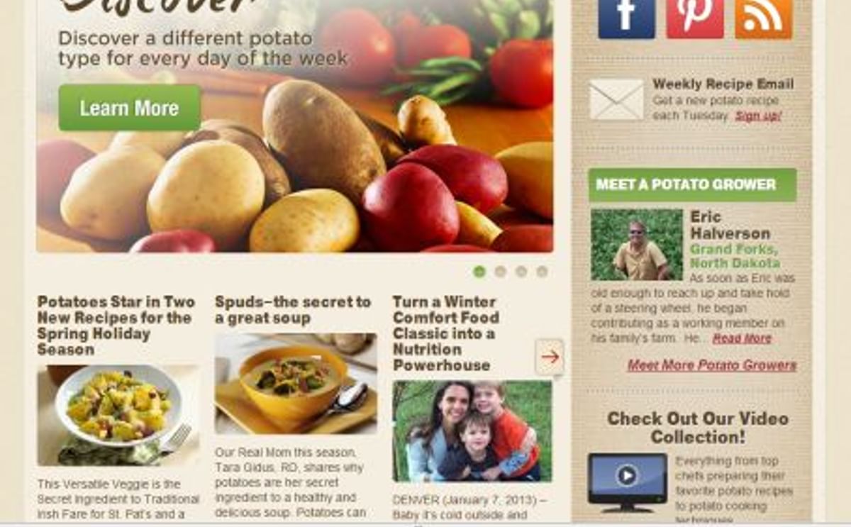
Potatogoodness.com is the United States Potato Board’s (USPB) all-things potato website, which gives consumers, chefs, product developers, nutrition educators and media a vast pool of information and potato recipes.
It’s been a good site. USPB decided to make it great. On December 28, 2012, the fresh, clean, streamlined redesigned site and mobile website went live. The Board selected Webolutions®, for the web design and development and ongoing Internet marketing.
“We work with organizations and businesses who want to make a difference in people’s lives,” said Webolutions CEO John Vachalek. “Our clients at the US Potato Board fit that description. This website design reflects their exemplary focus and dedication.”
A primary goal for redesign was to improve the user experience so “Linda,” the name the US Potato Board has given to its profile for home meal planners, could easily find inspiration to serve potatoes at least one more time a week, whether it was in the recipe section or the pages designed “Just for You.”
Another goal was to build in functionality to entice Linda to interact with the Board, share information on her social media platforms (Facebook, Twitter, Pinterest, etc.) and offer feedback. This is important to Linda and to search engines, as they now take into account social media relevancy when rating and ranking content.
In just its first two months, the redesigned website demonstrated:
- Improved search engine visibility as measured by 89 percent increase in visits and an 87 percent increase in unique visitors over the highest traffic month in the previous year.
- Improved user experience as measured by a 114 percent increase in total page views and a 75 percent increase in time spent on the site over the same period in 2012.
- Major increase in conversion rate as indicated by a 68 percent increase in signups for the Weekly Potato Recipe Email in January over the best month in the previous year (“conversion rate” is the percentage of visitors taking action that goes beyond casual website visit).
- Over 38,000 visits to the mobile website—equal to two-thirds of the totals for the entire 2012 calendar year.
Additional features of the website and mobile website include:
- Site search allows users to easily search all content in the site, including recipes.
- Facebook and Pinterest icons featured prominently on the site, driving ongoing cross-channel engagement.
- RSS feed eases marketing and consumption of website content.
- Social Sharing on the site makes it very easy for users to share content on their social networks or via email.c “Hot Potato News” blog with categories created for specific target audiences.
- Prominent graphic interface on the home page that links to any type of content within the site.
- Prominently featured ‘Meet a Potato Grower’ section.
- Easier and more personalized user engagement with and sharing of potato recipes.
Administration of the website is also improved, enabling the Board to reduce ongoing budget for the initiative while achieving improved results and setting more aggressive goals.
“The Board has always produced excellent content,” said Vachalek. “The new website eases consumption and engagement with that content while reflecting the full scope of the Board’s market identity and providing scalability available through new tools.”
Source: Webolutions


