Erwin and Fons Tummers, proudly presenting their new branding
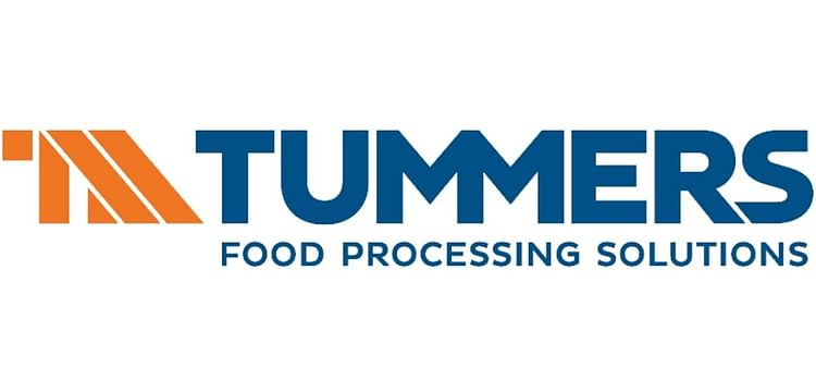
Tummers presents its new corporate logo
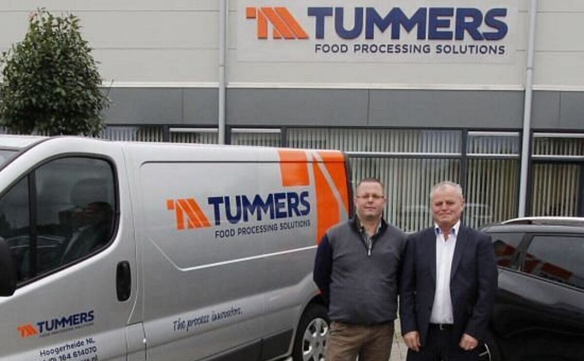
Tummers proudly announces the launch of a new company logo as part of the ongoing development and activities of our company.
"In this successful year of 2014 we would like to reflect on what our company stands for and what roads we want to take in the future. The name Tummers has become a strong brand in the food processing industry worldwide, and therefore deserves to be the star in our new logo. The famous colours of orange and blue, which have become a part of our corporate branding, have been given a significant role again. Under the Tummers umbrella the various operating companies and trade marks then get their own place," says Erwin Tummers.

"You will encounter the new logo frequently in the future; on our company cars, stationery and all kinds of commercial messages, but if you intend to visit the Interpom exhibition in Kortrijk in November then you cannot miss it!"
Like to receive news like this by email? Join and Subscribe!
NEW! Join Our BlueSky Channel for regular updates!
Highlighted Company
Sponsored Content
Sponsored Content
Sponsored Content
Related Events
Sponsored Content
Sponsored Content


