Tavern Crisps New Design
Tavern Crisps get new packaging design

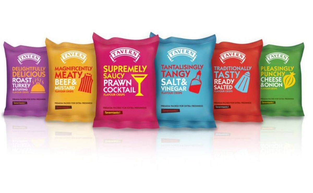
Greenwich Design has redesigned the packaging for Tavern Snack’s crisps, giving a more focused, adventurous, modern style to the range. The new-look packaging is aligned with Tavern’s nut range, which Greenwich redesigned last year, along with Tavern’s brand identity, introducing a totally revamped look and feel for the brand as part of a wider brand refresh strategy to enhance Tavern’s reputation.
Tavern Snacks supplies snacks, crisps and nuts to pubs, restaurants and clubs in London and the South-East, and although the brand has a much higher profile within the crisps category than nuts, the crisp category is much more dynamic and competitive, and more about brand than product, so Tavern really wanted to pack a punch and portray a ‘younger’ feel for these products.
In order to do so, Greenwich Design wanted to add a level of fun and ‘Britishness’ to Tavern’s crisp range. They have developed a set of new titles, adding a quirky dimension to the personality and giving the range a level of eccentricity.
The packaging for the range of six products – Delightfully Delicious Roast Turkey, Magnificently Meaty Beef and Mustard, Supremely Saucy Prawn Cocktail, Tantalisingly Tangy Salt and Vinegar, Traditionally Tasty Ready Salted, and Pleasingly Punchy Cheese and Onion - has been pared back for a more confident, less cluttered look, with each pack using relevant colour cues and bold naming, typography and graphics which reflect the flavour.
The re-design of the crisp range follows an original brief given to Greenwich Design to design packaging for a new Chilli Peanut product. However, the agency demonstrated to Tavern Snacks that the inconsistent look and feel of the existing product range was damaging brand presence and limiting its appeal, especially amongst the younger, more sophisticated segments of its target audience.
As a result, Tavern Snacks tasked Greenwich Design to consolidate the brand and pack range identity in order to build a more powerful brand impact at point of sale, appeal to a wider audience and create a more measurable difference to sales. The agency also creating complementary PoS and advertising activity and is now working on the Pork Scratching range which will be launched later this year. Lead designer on the project at Greenwich Design has been Kate Clancy.
Like to receive news like this by email? Join and Subscribe!
Get the latest potato industry news straight to your WhatsApp. Join the PotatoPro WhatsApp Community!
Sponsored Content
Sponsored Content
Sponsored Content
Sponsored Content


